Android - Custom Components
Implementing own components in pre built-in components with extending subclass with own defined class
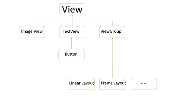
Android offers a great list of pre-built widgets like Button, TextView, EditText, ListView, CheckBox, RadioButton, Gallery, Spinner, AutoCompleteTextView etc. which you can use directly in your Android application development, but there may be a situation when you are not satisfied with existing functionality of any of the available widgets. Android provides you with means of creating your own custom components which you can customized to suit your needs.
If you only need to make small adjustments to an existing widget or layout, you can simply subclass the widget or layout and override its methods which will give you precise control over the appearance and function of a screen element.
This tutorial explains you how to create custom Views and use them in your application using simple and easy steps.
EXAMPLE OF CUSTOM COMPONENTS IN CUSTOM VIEW HIERARCHY
Creating a Simple Custom Component
| Step | Description |
|---|---|
| 1 | You will use Android studio IDE to create an Android application and name it as compoundview under a packagecom.vogella.android.customview.compoundview as explained in the Hello World Example chapter. |
| 2 | Create an XML res/values/attrs.xml file to define new attributes along with their data type. |
| 3 | Create src/ColorOptionsView.java file and add the code to define your custom component. It will extend LinearLayout and will have additional functionality to show colour compound . You will provide attributes parsing logic in of the constructors having AttributeSet as a parameter. |
| 4 | Modify res/layout/activity_main.xml file and add the code to create Colour compound view instance along with few default attributes and new attributes. |
| 5 | Run the application to launch Android emulator and verify the result of the changes done in the application. |
Create the following attributes file called attrs.xml in your res/values folder.
<?xml version="1.0" encoding="utf-8"?>
<resources>
   <declare-styleable name="Options">
      <attr name="titleText" format="string" localization="suggested" />
      <attr name="valueColor" format="color" />
   </declare-styleable>
</resources>
Change the layout file used by the activity to the following.
<LinearLayout xmlns:android="http://schemas.android.com/apk/res/android"
   xmlns:tools="http://schemas.android.com/tools"
   xmlns:custom="http://schemas.android.com/apk/res/com.vogella.android.view.compoundview"
   android:layout_width="match_parent"
   android:layout_height="match_parent"
   android:orientation="vertical"
   android:showDividers="middle"
   android:divider="?android:attr/listDivider"
   tools:context=".MainActivity" >

   <com.vogella.android.view.compoundview.ColorOptionsView
      android:id="@+id/view1"
      android:layout_width="match_parent"
      android:layout_height="?android:attr/listPreferredItemHeight"
      android:background="?android:selectableItemBackground"
      android:onClick="onClicked"
      custom:titleText="Background color"
      custom:valueColor="@android:color/holo_green_light"/>

   <com.vogella.android.view.compoundview.ColorOptionsView
      android:id="@+id/view2"
      android:layout_width="match_parent"
      android:layout_height="?android:attr/listPreferredItemHeight"
      android:background="?android:selectableItemBackground"
      android:onClick="onClicked"
      custom:titleText="Foreground color"
      custom:valueColor="@android:color/holo_orange_dark"/>

</LinearLayout>
Create the following java file called ColorOptionsView for your compound view.
package com.vogella.android.customview.compoundview;

import com.vogella.android.view.compoundview.R;

import android.content.Context;
import android.content.res.TypedArray;
import android.util.AttributeSet;
import android.view.Gravity;
import android.view.LayoutInflater;
import android.view.View;
import android.widget.ImageView;
import android.widget.LinearLayout;
import android.widget.TextView;

public class ColorOptionsView extends LinearLayout {
   private View mValue;
   private ImageView mImage;

   public ColorOptionsView(Context context, AttributeSet attrs) {
      super(context, attrs);

      TypedArray a = context.obtainStyledAttributes(attrs,R.styleable.ColorOptionsView, 0, 0);
      String titleText = a.getString(R.styleable.ColorOptionsView_titleText);

      int valueColor = a.getColor(R.styleable.ColorOptionsView_valueColor,android.R.color.holo_blue_light);
      a.recycle();

      setOrientation(LinearLayout.HORIZONTAL);
      setGravity(Gravity.CENTER_VERTICAL);

      LayoutInflater inflater = (LayoutInflater) context.getSystemService(Context.LAYOUT_INFLATER_SERVICE);
      inflater.inflate(R.layout.view_color_options, this, true);
      TextView title = (TextView) getChildAt(0);
      title.setText(titleText);

      mValue = getChildAt(1);
      mValue.setBackgroundColor(valueColor);
      mImage = (ImageView) getChildAt(2);
   }

   public ColorOptionsView(Context context) {
      this(context, null);
   }

   public void setValueColor(int color) {
      mValue.setBackgroundColor(color);
   }

   public void setImageVisible(boolean visible) {
      mImage.setVisibility(visible ? View.VISIBLE : View.GONE);
   }
}
Change your Main activity java file to the following code and run your application.
package com.vogella.android.customview.compoundview;

import com.vogella.android.view.compoundview.R;

import android.app.Activity;
import android.os.Bundle;
import android.view.Menu;
import android.view.View;
import android.widget.Toast;

public class MainActivity extends Activity {
   @Override
   protected void onCreate(Bundle savedInstanceState) {
      super.onCreate(savedInstanceState);
      setContentView(R.layout.activity_main);
   }

   @Override
   public boolean onCreateOptionsMenu(Menu menu) {
      // Inflate the menu; this adds items to the action bar if it is present.
      getMenuInflater().inflate(R.menu.activity_main, menu);
      return true;
   }

   public void onClicked(View view) {
      String text = view.getId() == R.id.view1 ? "Background" : "Foreground";
      Toast.makeText(this, text, Toast.LENGTH_SHORT).show();
   }
}
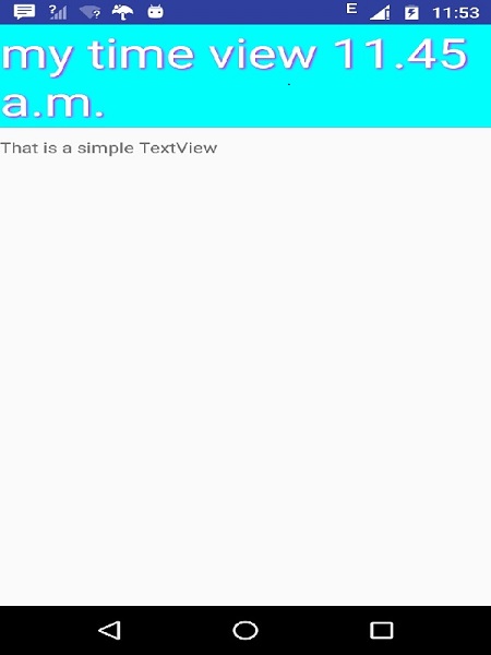
The running application should look like the following screen shot.
Instantiate using code inside activity class
It is very similar way of instantiating custom component the way you instantiate built-in widget in your activity class. For example you can use following code to instantiate above defined custom component −
@Override
protected void onCreate(Bundle savedInstanceState) {
   super.onCreate(savedInstanceState);
   setContentView(R.layout.activity_main);

   DateView dateView = new DateView(this);
   setContentView(dateView);
}
Check Above example to understand how to Instantiate a Basic Android Custom Component using code inside an activity.
Instantiate using Layout XML file
Traditionally you use Layout XML file to instantiate your built-in widgets, same concept will apply on your custom widgets as well so you will be able to instantiate your custom component using Layout XML file as explained below. Here com.example.compoundview is the package where you have put all the code related to DateView class and DateView is Java class name where you have put complete logic of your custom component.
<RelativeLayout xmlns:android="http://schemas.android.com/apk/res/android"
   xmlns:tools="http://schemas.android.com/tools"
   android:layout_width="match_parent"
   android:layout_height="match_parent"
   android:paddingBottom="@dimen/activity_vertical_margin"
   android:paddingLeft="@dimen/activity_horizontal_margin"
   android:paddingRight="@dimen/activity_horizontal_margin"
   android:paddingTop="@dimen/activity_vertical_margin"
   tools:context=".MainActivity" >

   <com.example.compoundview.DateView
      android:layout_width="match_parent"
      android:layout_height="wrap_content"
      android:textColor="#fff"
      android:textSize="40sp"
      android:background="#000"/>
</RelativeLayout>
It is important to note here that we are using all TextView attributes along with custom component without any change. Similar way you will be able to use all the events, and methods along with DateView component.
Check this example to understand how to Instantiate a Basic Android Custom Component using Layout XML file.
Custom Component with Custom Attributes
We have seen how we can extend functionality of built-in widgets but in both the examples given above we saw that extended component can make use of all the default attributes of its parent class. But consider a situation when you want to create your own attribute from scratch. Below is a simple procedure to create and use new attributes for Android Custom components. Consider we want to introduce three attributes and will use them as shown below −
<com.example.compoundview.DateView
   android:layout_width="match_parent"
   android:layout_height="wrap_content"
   android:textColor="#fff"
   android:textSize="40sp"
   custom:delimiter="-"
   custom:fancyText="true"/>
Step 1
The first step to enable us to use our custom attributes is to define them in a new xml file under res/values/ and call it attrs.xml. Let's have a look on an example attrs.xml file −
<?xml version="1.0" encoding="utf-8"?>
<resources>
   <declare-styleable name="DateView">
   <attr name="delimiter" format="string"/>
   <attr name="fancyText" format="boolean"/>
   </declare-styleable>
</resources>
Here the name=value is what we want to use in our Layout XML file as attribute, and the format=type is the type of attribute.
Step 2
Your second step will be to read these attributes from Layout XML file and set them for the component. This logic will go in the constructors that get passed an AttributeSet, since that is what contains the XML attributes. To read the values in the XML, you need to first create a TypedArray from the AttributeSet, then use that to read and set the values as shown in the below example code −
TypedArray a = context.obtainStyledAttributes(attrs, R.styleable.DateView);

final int N = a.getIndexCount();
for (int i = 0; i < N; ++i)
{
   int attr = a.getIndex(i);
   switch (attr)
   {
      case R.styleable.DateView_delimiter:
      String delimiter = a.getString(attr);

      //...do something with delimiter...
      break;

      case R.styleable.DateView_fancyText:
      boolean fancyText = a.getBoolean(attr, false);

      //...do something with fancyText...
      break;
   }
}
a.recycle();
Step 3
Finally you can use your defined attributes in your Layout XML file as follows −
<RelativeLayout xmlns:android="http://schemas.android.com/apk/res/android"
   xmlns:tools="http://schemas.android.com/tools"
   xmlns:custom="http://schemas.android.com/apk/res/com.example.compoundview"
   android:layout_width="match_parent"
   android:layout_height="match_parent"
   android:paddingBottom="@dimen/activity_vertical_margin"
   android:paddingLeft="@dimen/activity_horizontal_margin"
   android:paddingRight="@dimen/activity_horizontal_margin"
   android:paddingTop="@dimen/activity_vertical_margin"
   tools:context=".MainActivity" >

   <com.example.compoundview.DateView
      android:layout_width="match_parent"
      android:layout_height="wrap_content"
      android:textColor="#fff"
      android:textSize="40sp"
      custom:delimiter="-"
      custom:fancyText="true"/>

</RelativeLayout>
The important part isxmlns:custom="http://schemas.android.com/apk/res/com.example.compoundview". Note that http://schemas.android.com/apk/res/ will remain as is, but last part will be set to your package name and also that you can use anything after xmlns:, in this example I used custom, but you could use any name you like.
Check this example to understand how to Create Custom Attributes for Android Custom Component with simple steps.


Comments
Post a Comment